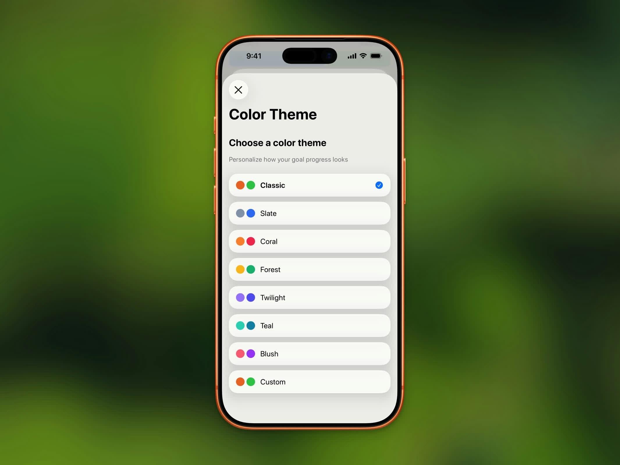
Color themes are a Pro feature. Free users use the default Classic theme.
Preset Themes
| Theme | In Progress | Completed |
|---|---|---|
| Classic | Orange | Green |
| Ruby | Crimson | Dark Red |
| Sapphire | Royal Blue | Dark Blue |
| Emerald | Green | Dark Green |
| Burgundy | Dark Red | Deep Red |
| Onyx | Gray | Black |
| Slate | Slate Blue | Blue |
| Coral | Coral | Rose |
| Forest | Amber | Emerald |
| Twilight | Violet | Indigo |
| Teal | Teal | Cyan |
| Blush | Pink | Purple |
Custom Colors
Choose your own colors with the custom theme option. You can set separate colors for:- In Progress - The color shown while you’re working toward your goal
- Completed - The color shown once you’ve reached your goal
- Rest Day - The color shown on days you’ve marked as rest days
Where Themes Apply
Your selected theme colors appear throughout the app:- Progress ring on the Home Dashboard
- Chart bars and highlights
- Home Screen and Lock Screen widgets
- Streak badge accents
How to Change Your Theme
- Open Settings
- Tap Color Theme
- Select a preset or tap Custom to pick your own colors